
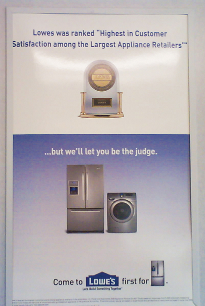

This poster really got under my skin the other day. I was on the train heading home and quickly scanned the poster. Immediately, problems seemed to jump off the poster. Now I know this is an ugly poster. And I'm sure not much time was spent on creating it. But it just had to many typographical & basic communication design errors that it was to hard for me to ignore.
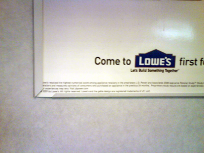
First off it looks like two separate posters. The top part seems to be talking about Lowe's winning the JD Power award for customer satisfaction and the bottom half is a poster advertising appliances for Lowe's. Easy way to unify it would have been to just have the background of the poster all white or carry the blue gradient to the top of the advertisement. Second problem is the bottom tag line, "Come to Lowe's first for appliances." What bothers me is that awkward period after the visual of the refrigerator. It would have worked it the used the word appliances or refrigerator, but using a visual instead - the period does not work. The period should not be there it seems like a mistake. A weird square dot just floating there. And finally the small print copy at the very bottom. They gave a hard return to a sentence that separates it from the rest of the copy - it looks bad. It's weird type break which just screams out MISTAKE!
thats is one ugly/boring poster
ReplyDeletei agree
ReplyDelete