

Thursday, December 31, 2009
Thursday, December 24, 2009

Wednesday, December 2, 2009
WNYC - Mapping New York City's Cultural Landscape
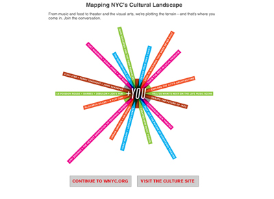
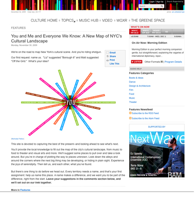
My morning routine, is to click onto the WNYC website and listen to their live streaming news. Today when I clicked on the WNYC link I was greeted by the top image - a bright colorful graphic, that caught my attention right away.
After reading and going through their website, http://culture.wnyc.org - I thought, "WOW! what a great idea." Not only are they mapping New York City's cultural landscape but it's another great way to interact with their listeners and even gain new listeners.
Below is their mission statement and what they are trying to achieve.
This site is devoted to capturing the best of the present--and looking ahead to see what's next. You’ll provide the local knowledge to fill out the map of the city's cultural landscape, from music to food to theater and visual arts and more. We'll suggest some places to pull over and take a look around. But you’re in charge of plotting the way to places unknown. Look down the alleys and around the corners where the next big thing may be developing, or hiding in plain sight. Experience the joys of serendipity. Then tell us, and each other, what you've found.
But there’s one thing to do before we head out. Every territory needs a name, and that's your first assignment: help us name this place. A name makes a difference, and we want you to be part of the difference, right from the start. Leave your suggestions in the comments section below, and we'll set out on our trek together.
Monday, November 30, 2009
A&E Hoarders Show - Taxi Promotion
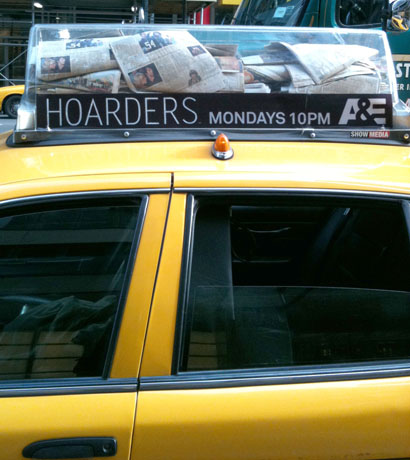
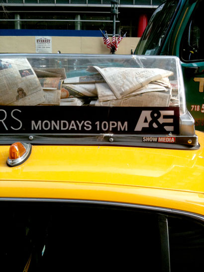
Walking into work today - I walked past three parked taxi cabs with the same A&E Hoarders promotion on their roof. I really like the simplicity of this promotion. All they did was filled a clear taxi roof sign with a bunch of old newspapers. Brilliant way to tie in to their show, also a pretty fun and unique way to use the taxi roof signs as their promotion.
Monday, November 16, 2009
Street Sweets: Improving the Idea of Street Vendors
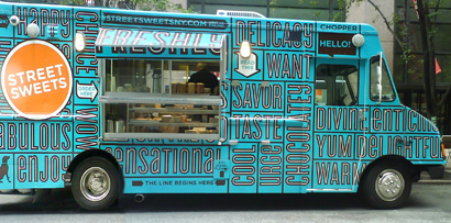
I came across Street Sweets one day walking to the MOMA museum on 53rd St. between 5th & 6th Ave, in New York City. The truck caught my attention right away from about half a block away. As a designer, I was automatically attracted to it because of the typography, color and the design of it. But what keeps me going back is their food, coffee and desserts.
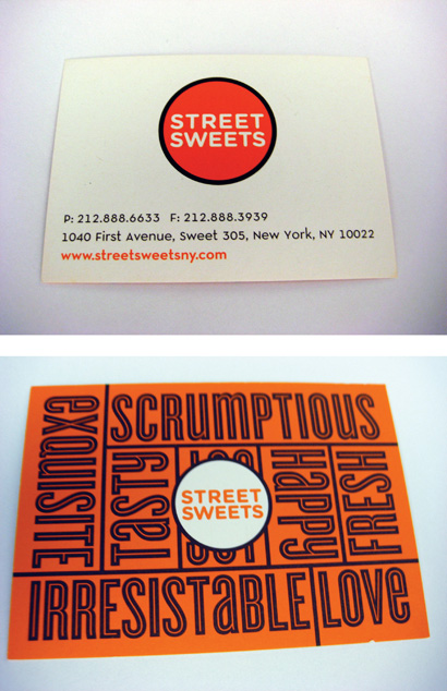
I really love the look of this truck -the typography is fun, clear and organized. You can't help but to read all the adjectives that are painted on the truck, (your eyes seem to automatically read them as you walk up to the truck). Their menu, business cards, coffee cups, and their website are designed beautifully. The simple orange logo fits perfectly on the truck and pops off the blue background. It is a magnificently designed package all around. I think I can safely say, this food truck stands above any other food truck in New York City and New Jersey.
I was interested in the origins of Street Sweets food truck so I contacted Grant Di Mille, one half of the husband and wife team (owners are Grant Di Mille & Samira Mahboubian).
I asked Grant some questions about the origins and branding of Street Sweets:
How did Street Sweets come about? Well, we both were working in marketing for over 24 years. Specifically in the print arena and seeing how bad things were getting, we decided last August to get out of the corporate world and get into the food business.
Did you have any experience in the food business? We knew nothing about the food business, but what we did know was we wanted to create a unique experience for New Yorkers that would be an alternative to the status quo. We knew it had to be aesthetically pleasing and something we could be proud of.
How did you come up with the look of the food truck? Coming from a marketing and branding background we knew the truck had to be easily recognizable as well as eye catching. We started by creating a custom food truck and had it painted a cyan. Originally we wanted to have a subway map painted onto the truck. But instead we came up with the idea of having words painted on the side of the truck that would describes the food we sell. Having our logo in an orange circle makes it easy for our customers to spot us.
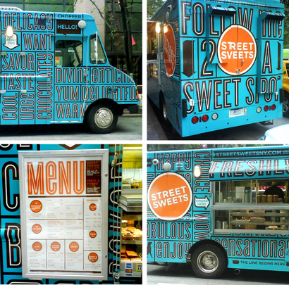
Is there any other collateral you created for the Street Sweets? The branding extends to a business card, rewards card and gift certificates. We purposely didn’t create flyers or loose take-out menus - we didn’t want to add to the paper trash that you see in New York. If you want to see our menu you can go to our website and download a copy or come up to the truck where the menu is mounted and displayed on the side.
I really like the big windows on the side of the truck – I’ve never seen anything like this before! We wanted to create a unique custom food truck -floor to ceiling windows was always a must. It serves two purposes. One, it showcases our product beautifully. Our customers can see all the freshly baked croissants, cookies, brownies and muffins. Second, this makes us stand out from other food trucks and lets our customers look into the truck.
Why would you want your customers to be able to see inside? Let me just say, I wouldn't eat from other food trucks because they are disgusting and dirty. But you wouldn't know that because you can't see what they are hiding inside their trucks. We on the other hand have absolutely nothing to hide, you can see inside the truck and see for yourself how clean it really is. Having this was very important to us.
I just want to say thank you to Grant for taking the time to talk to me. I visit Street Sweets at least once a week. I am a fan of their food, their design and what they are trying to accomplish. If you want more information on Street Sweets click on the word Street Sweets to go directly to their website. Or if you want to know where they are going to be next click here to follow Street Sweets on Twitter.
Thursday, November 5, 2009
Fatherhood the reason for my lack of posts:)
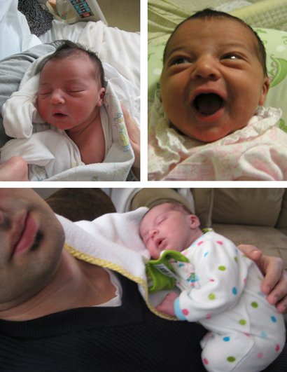
Sorry for the lack of posts recently. But last week I became a father - I took two weeks off of work to bond with my little girl Sofia. Now I've been trying to figure out how to balance fatherhood and the rest of my life. Which for anyone who has kids must understand how difficult it really is. One thing I have been doing is taking a lot of photos.
By next week I should be back in business. Please hang in there.
Thursday, October 22, 2009
The Humanity of Vogue magazine
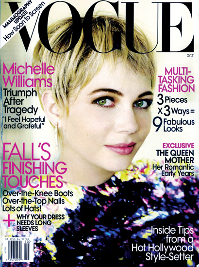
Being interested in print and editorial design, I read as well as look through many magazines month to month. Now, before I continue I should mention that from time to time I do read and look through Vogue magazine. (And I am not ashamed of it!)
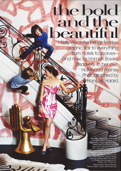
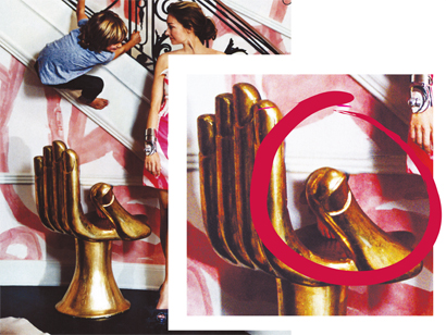
Yesterday while carefully looking/reading through the October 2009 issue of Vogue. An opening photo from the story, The Bold and the Beautiful on page 254 caught my attention. Something looked off and I could not put my finger on it. On closer examination, I noticed a foot under the thumb on the gold hand chair. At this point I thought I must be mistaken. Then I noticed the foots reflection in the chair. On closer inspection you can also see that they did a quick and rough photo retouch on the chair rail - the chair rail doesn't really line up.
Vogue is seen as invulnerable and ethereal in their editorial and photography. I am not saying that isn't true, but sometimes it's good to see that they are human.
Subscribe to:
Posts (Atom)