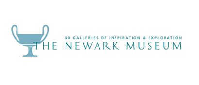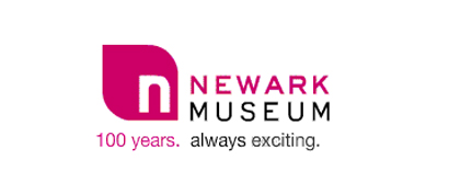

Been meaning to talk about this for a while. In Newark, New Jersey there is a museum (The Newark Museum) that has been around for 100 years. I remember going to the museum when I was a kid and I have continued visiting it as an adult. I have a soft spot for the museum - It's not the biggest museum and it's certainly not the flashiest. Thats why I was shocked when they came out with a new advertising campaign promoting their 2009 Centennial Celebration with a brand new redesigned logo.
Now I agree that they needed to redesign their logo - but this new logo makes no sense to me. In my opinion, this new logo was picked because it looks young and trendy. Thats it! It doesn't reference the old museum logo or for that matter anything at the museum. Being familiar with the museum and visiting it so many times - I could not come up with any good rational to defend this new logo. Look I understand that they need to appeal to a younger crowd, I totally get that. But, I feel this could have done this in a better way. What's the point of a logo that has no meaning.

aren't all museums doing this? i feel like all museums are redesigning their logos.
ReplyDeleteRecently there has been a lot of museum logos discussed. The re-designed ones sometimes reference the older logo in some way. There are a few - that I agree come out of left field and have no reference to the past. But also there have brand new museums that have no history so there is a brand new logo.
ReplyDeleteit's a fine line that museums cross when designing a logo. its always love or hate, works or doesn't. there is no inbetween.
ReplyDeletelogos or a funny little pieces of art you either love or hate it. i don't mind the new logo but then again it doesn't say museum either.
ReplyDeleteLogos are hard to create I know. I've created a bunch of bad ones but I find having an idea or concept behind it makes it's easier to create something that is good and has meaning.
ReplyDeleteToo bad they did neither for The Newark Museum.