Showing posts with label Graphic Design. Show all posts
Showing posts with label Graphic Design. Show all posts
Tuesday, October 6, 2009
Stefan Sagmeister - (Ted Talk) The Power of Time Off
I know this video has been posted on a couple of blogs and websites. But, I am a big fan of Stefan Sagmeister (like probably many of you are). I feel he is designing in a way most graphic designers aspire too. He has an interesting way at looking at design - also a very introspective way at looking at himself and his design projects. When he talks people should listen and pay attention. I agree with him that sabbaticals are very important, (I have been trying to convince employers of this for years now with no success).
Wednesday, August 26, 2009
Pret A Manger where you'll always find good package design

Pret A Manger is a very convenient place for me to go and eat because of its proximity to my job -just around corner. Every time I buy something there to eat, I end up staring at it and admiring the design of it.
Take this orange soda can - I really like the playful image of the orange made to look like a fish. Not sure why they took an orange and shaped it into a fish? (thought about it for a second, maybe the used a fish because soda is a liquid and fish live in a liquid?) But it gives the whole design a cheery carefree feeling to it. Also like the side of the can with the bubbles reinforcing the fish theme as well as suggesting the bubbles in the soda.
(Sorry for the quality of the photos all I had was my cell phone camera with me that day.)
Labels:
Graphic Design,
orange soda,
package design,
pret,
Pret a Manger
Thursday, July 30, 2009
Not a Fan of the Redesigned Newark Museum Logo

Been meaning to talk about this for a while. In Newark, New Jersey there is a museum (The Newark Museum) that has been around for 100 years. I remember going to the museum when I was a kid and I have continued visiting it as an adult. I have a soft spot for the museum - It's not the biggest museum and it's certainly not the flashiest. Thats why I was shocked when they came out with a new advertising campaign promoting their 2009 Centennial Celebration with a brand new redesigned logo.
Now I agree that they needed to redesign their logo - but this new logo makes no sense to me. In my opinion, this new logo was picked because it looks young and trendy. Thats it! It doesn't reference the old museum logo or for that matter anything at the museum. Being familiar with the museum and visiting it so many times - I could not come up with any good rational to defend this new logo. Look I understand that they need to appeal to a younger crowd, I totally get that. But, I feel this could have done this in a better way. What's the point of a logo that has no meaning.
Labels:
Graphic Design,
logo,
museum,
new jersey,
Newark,
NJ,
Redesign,
The Newark Museum
Tuesday, July 21, 2009
Yummy Rats - from Ikea:)
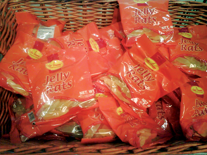
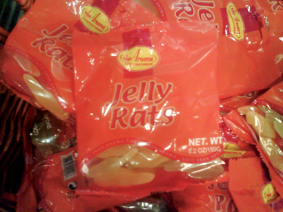
One of my favorite sections in Ikea is their strange but fun swiss food section. I enjoy going through this section and buying something I have never eaten before. This past weekend I was there while they were restocking the Jelly Rats. They look like long "rat shaped" chewy candy. I found the name hilarious and fascinating - Why Jelly Rats?
Whatever the reason the name still makes me laugh.
Labels:
candy,
chewy,
Graphic Design,
Ikea,
Jelly Rats,
packaging design,
Swiss
Wednesday, July 15, 2009
Favorite State & Country Logos
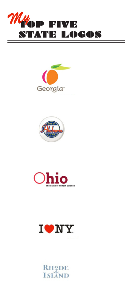
Out of all 50 state logos that exist these are my top five picks. Most state logos are just simple type, sometimes it looks fine - but I chose these based on uniqueness.
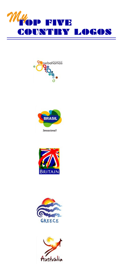
If you look at all the country logos they all kind of start looking the same. Most of them look like updated folk art or use colorful colors for their fonts. They all seem to blend and look the same. These are the few that stood out to me.
Labels:
country logos,
Design,
Graphic Design,
logos,
state logos
Tuesday, May 12, 2009
I See Pop Chips Everywhere
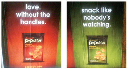
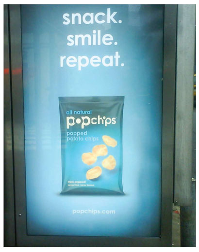
These ads seem to be popping up everywhere I look, (pun intended). This visual bombardment made me take notice - which in turn led me to post about them.
The packaging is simple, clean and to the point. Very unique and fun typographical treatment. I really like their color-code system for each flavor of chips they produce. The whole look will definitely make it stand out on store shelves. The ads really co-exist nicely with the packaging - Overall a very good advertising campaign. (I do remember seeing this packaging about a year ago on The Dieline website, back then I thought it was a very different (in a good way) for a potato chip packaging.)
They are supposed to different type of potato chip compared to other potato chips theses are literally popped into existence. They apply heat and pressure to the potato and create an unique looking and tasting chip. I have yet to buy them so I can’t comment on their taste. But if you are curious here’s their website where they list all the stores where you can purchase them - www.popchips.com
Labels:
advertising,
dieline,
Graphic Design,
pop chips,
typographic
Friday, May 8, 2009
Design without Borders discussion at NYIT


I went to a graphic design discussion last Friday, called Designers without Borders at NYIT (New York Institute of Technology). The talk centered around a panel discussion about design in a globalized world. Designers that participated in the discussion were:
Roberto de Vicq – company Vicq Design born in Brazil.
Matteo Bologna – company Mucca Design born in Italy.
Maya Kopytman – company C&G Partners LLC born in Russia (but moved to Israel)
Carole Goodman – company Blue Anchor Design born in United States (New Jersey)
Takaaki Matsumoto – company Matsumoto Inc born in Japan.
Pablo Medina – company Cubanica born in the United Stated (Washington D.C moved to New Jersey)
The talk overall was interesting. It was fun hearing from all the designers discussing their background: where they came from, what projects they worked on, funny stories about people they worked with, etc… They discussed cultural differences and how they dealt with it all in their own way. Some designers had problems assimilating to the language and some had a hard time dealing and working with other cultures.
Something I found interesting was that they all pretty much felt that their cultural backgrounds did not influence their design. I’m not sure that’s true. They might think their cultural background doesn’t appear in their design but I disagree. It might not be so obvious, like a design style or certain look that can somehow represent their country of origin. But their cultural background influences the way they think and problem solve. Which is a big part of graphic design.
Another topic they brought up was about how in some countries graphic designers are treated differently, almost like “Rock Stars.” In certain cultures clients value the designer and their opinion more than they do here. They know your work and ask for your help on what to do. They don’t dictate their idea, you design what you think works. They look to you for answers and guidance. This was also a revelation to me -I know some companies here in the states do seek out designers’ guidance for ideas and projects but for the most part, we are there to communicate their ideas. If they don’t like what we have produced, they will tell us and sometimes they’ll tell us how to make it better.
Overall, a good talk with lively designers that kept you engaged. Glad I went. I look forward to more talks from NYIT.
Tuesday, March 24, 2009
Similar but Different


Let me state that I am not implying that anyone one pictured above is copying anyone else. They may look similar but they are executed very differently in-turn creating an original design. But how many times have you worked on something only to have someone say, I've seen that before.
You work long hours, sketching, creating mind maps, the design is not quite there yet, slight tweaks, different typefaces, flipping the image with the text, making the fonts bigger then smaller, make the photos bigger then smaller, bolding fonts, epiphany strikes, then eureka an original design. Then someone looks at it says, that's looks okay but I saw the same thing in such and such magazine. You turn to them and say, What are you crazy? I worked on this for a month this is my original idea. They turn to you and say yeah sure it is. And then they show you something that they think looks exactly like your design but not really. You explain to them calmly what makes your design different and original but they still don't see it and say, no its the same thing. FRUSTRATION STRIKES...
But I too am guilty of this - About a month ago I met up with 2 friends of mine they handed me their company's 2009 New Year's card, that they designed (Q Collective-check out their site they are great designers and a source of inspiration for me), the 2009 card is pictured above on the top left. When I saw it, like an idiot I blurted out, "wait I've seen this before." I didn't mean to make it sound like they had copied it from someone else, even though I'm sure that's how it came across, (in my defense I was drinking and had no tolerance for alcohol at the time). But I felt horrible that I even said that. That night when I got home I looked at a couple of sites that I had looked at earlier that morning (the images that are on the top right hand side are the ones I saw that day). They have some small similarities but they look nothing alike. And that is the point.
Is it hard for people (I speaking of non-designers) to actually see the difference? You can explain it till you are blue in the face, they still don't get it. Does anyone else run into this problem? How do you or did you handle it? Email me letting me know, at loquat73@gmail.com - I'm curious to see how many people run into this same problem.
Labels:
frustrations,
Graphic Design,
similar design
Sunday, March 1, 2009
A Positive Note on the Whole Tropicana Redesign


Side Note: In the long run this whole Tropicana misstep (in misstep I'm talking about Pepsi Co pulling the new Tropicana design) will become a problem for the graphic design community and designers in general. As a fall out from all this, I fear that companies will rethink redesigning their products - as well as second-guessing graphic designers and their design decisions. This will hurt the graphic design community tremendously.
Thursday, February 5, 2009
2009 HOW Design Conference

If you have never gone to one of How's conferences you should really consider it. It's a good way to keep in touch with other designers as well as keep up to date with the design community in general. This year they have fifty speakers with a variety of panels, sessions and discussions. Check it out if you haven't already, http://www.howconference.com/GeneralMenu/
Subscribe to:
Posts (Atom)
